[ad_1]
You probably don’t dream about CSS element sizing at night, but if you’re building a website or an app, this topic is definitely worth thinking about.
While some CSS units play nicely with your responsive design, others might show a rebellious streak. Being able to tell the different characters can save you some major headaches down the line.
Take the pairing of REM and EM. Which should you use, and why?
Stick with us for the next few paragraphs, and we shall reveal all!
REM vs. EM in a Nutshell
If you’re looking for a quick answer, here’s the TL;DR version:
- REM: This unit is based on the root element (usually the
tag.) No matter what else happens on the page, your sizing will stay consistent. - EM: This unit looks up for guidance. If the parent element changes, your sizing will follow suit.
If you want to remember the difference, keep in mind that the “R” in REM stands for “root.”

Nerd Note: Why do both units end with “EM”? This isn’t an abbreviation. Back when all text was printed, typographers used the width of a capital M as a benchmark for text sizing. Pretty nifty, right?
So, which one should you use?
Well, that depends.
If you want text to adjust to its surroundings, EM might be the better option. But if you want sizing to stay consistent across your whole website, you should switch to REM.
Why?
- EM: More flexible, but can get messy if you’re not careful.
- REM: Consistent sizing, great for responsive design.
Responsive Design
Responsive design enables a website to adapt to the screen size of the device it is being viewed on. The website will therefore look differently on different devices.
Read More
Still confused? Don’t worry, we’ll dive deeper in a second.
Just remember this for now: REM is usually the safer bet for most websites.
Understanding REM and EM
Alright, let’s get into the weeds a little bit.
Both REM and EM are relative units. That means they maintain the same size relative to a specific yardstick.
This type of sizing plays a key role in responsive design.
Absolute sizes (e.g., px) always stay the same, meaning text can appear tiny on a desktop and huge on a phone. In contrast, relative units can adapt to different devices and layouts.
In a digital context, REM and EM are still primarily used to measure text. However, you can also use these units for:
- Margins
- Padding
- Width and height
- Line height
- Border properties
- Box shadow
- Positioning
- Media queries
In other words, REM and EM are useful whenever you want flexible sizing within your design.
Right, that largely covers the common ground between these two units.
Now, let’s take a closer look at what makes each of them unique.
Getting To Know REM
REM stands for “root em.” When you use this unit, you’re defining how big something should be, relative to the font size of your root element (usually your tag.)
Most browsers default to 16px for the root element. However, it’s a good idea to define your default font size using CSS.
You can do it like this:
html { font-size: 16px; /* Your base font size */ }
Whatever size you choose becomes 1rem. This is your new baseline for the entire page.
Any figure that’s bigger or smaller will change the size of your target element, relative to your chosen default.
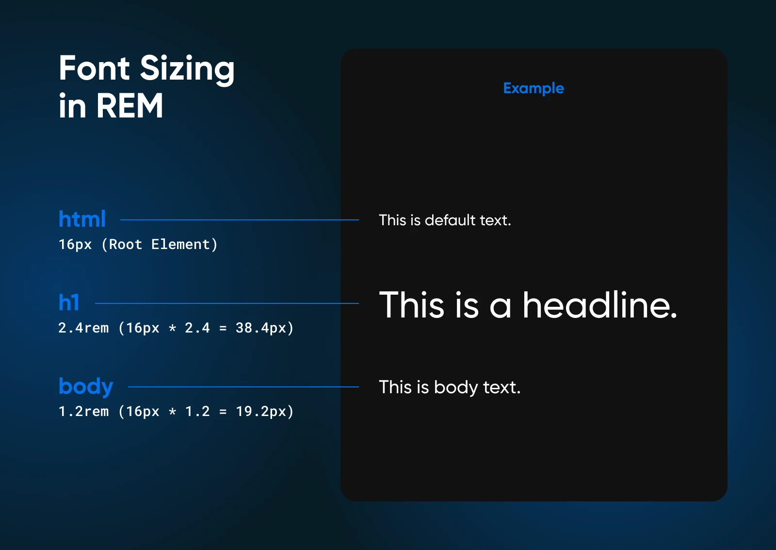
It’s a bit complicated to explain clearly, so here is an easy example:
html { font-size: 16px; /* Your base font size */ }
body { font-size: 1.2rem; /* 19.2px */ }
h1 { font-size: 2.4rem; /* 38.4px */ }
In this scenario, we’ve defined the font size of the tag as 16px. This is our baseline of 1rem.
We want our body text to be a little bigger than that. So, we set the font size to 1.2rem. That’s 120% of the baseline.
The main header on our page needs to be way bigger. By setting the font size to 2.4rem, we can make the headline 240% the size of our baseline.
You’ll end up with something like this:

Why Use REM?
What are the advantages of this system?
In CSS, REM units offer some pretty good benefits:
- True consistency: Everything scales proportionally based on the root size, so your design will always look exactly how you intended on any device.
- Responsiveness: Proportionate scaling means your website or app can adapt to a wide range of devices.
- Easy maintenance: When all your styles are based on the same root setting, it’s easy to make sweeping changes as needed — You don’t need to visit every single element and change the font size manually. This also saves you a lot of time.
- Great accessibility: Quite a lot of people actually change the default font size of their browsers to make text easier to read. By using REM sizing, your design can adapt to these user preferences.
Of course, it’s not all sunshine and rainbows. There are some drawbacks:
- Third-party wildcards: If your site includes embedded content, you might find that text and other elements don’t follow your REM rules.
- Tricky calculations: Figuring out exactly how big 1.2rem is going to be requires some math.
- Great power, greater responsibility: When you can alter the size of text across your website so easily, you need to be careful with edits to avoid site-wide design disasters!
As a general rule, REM should be your go-to for most projects. It’s easier to handle than EM sizing, and the results are more predictable.
However, there are times when EM is useful.
Getting To Know EM
EM is a tricky customer. This unit is based on the font size of its parent element — like a chameleon adapting to its surroundings.
The confusion begins when you start nesting. Most elements inherit their default font size from their parent. But what if the parent also uses EM sizing? You could end up with a tangled mess of proportionality pretty easily.
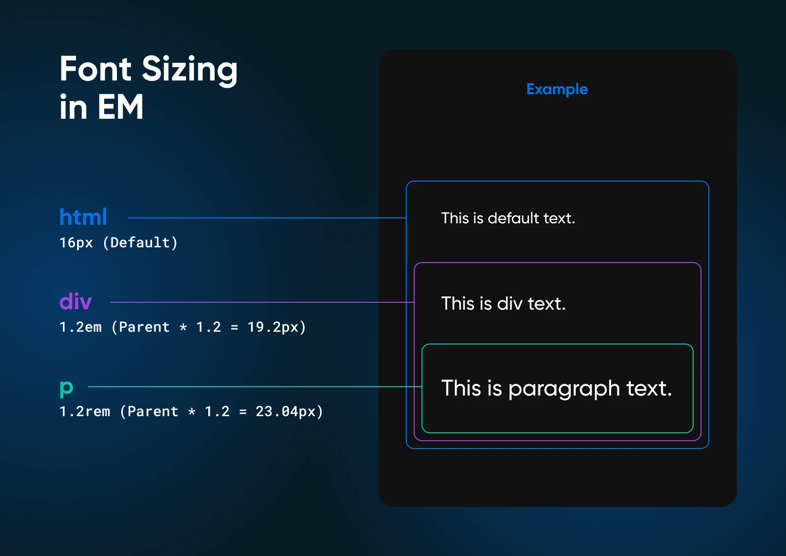
Here’s a simple example:
Say you have a page that contains a
Now, take a look at the CSS for this HTML snippet:
html { font-size: 16px; /* Starting default size */ }
div { font-size: 1.2em; /* 19.2px */ }
p { font-size: 1.2em; /* 23.04px */ }
We started by defining the default font size for the whole page. So far, so good.
Next, we said that
1.2em. In other words, our text should be 120% of the parent element default.
To finish up, we also make the font size 1.2em.

Now wait a minute! There is a significant increase in the text’s size, as measured in pixels.
Why’s that?
The element has looked at the font size of its parent
1.2em, we get text that is 120% of the default size.
These kinds of errors are easy to make when you work with the EM unit.
EM Is Great for Specific Sizing
Aside from the drawbacks, the EM unit can be really useful for sizing specific components.
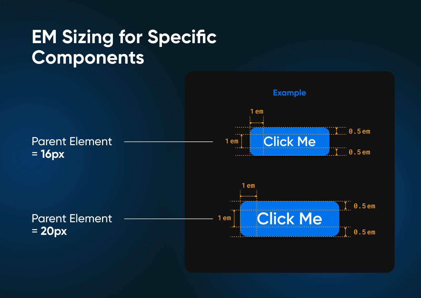
Say you want to create a button that always takes up roughly the same amount of space within its parent element.
Your HTML code might be:
To style your button, you could use EM units for font-size and padding.
The CSS would look something like this:
.button {
    font-size: 1em; /* Size relative to the parent text size */
    padding: 0.5em 1em; /* Padding scales with the font size */
}
The code above gives us a simple button with a little bit of padding around the text.

If the parent element’s font size scales upward, the font size and padding of the button will follow suit.
In this way, you’ll be able to maintain the same visual balance between elements within the parent, even if you change devices or zoom level.
Why Use EM?
Given all the confusion, why would you use EM at all?
Well, it does come with some benefits:
- Contextual scaling: Elements scale based on their parent’s size, giving you more nuanced control over sizing throughout your design.
- Component-based design: EM units are great for creating self-contained, reusable components that maintain the same proportions.
- Precise control: You can fine-tune sizes at each document structure level, without making wholesale changes.
- Responsiveness: Like REM, EM units allow your design to adapt to different screen sizes and user preferences.
As we’ve seen, there are also some drawbacks:
- Compounding effects: Nested elements can lead to unexpected sizes, as EM values start to stack up.
- Maintenance challenges: Changing a parent element font size affects all child elements, which can lead to unintended consequences — such as huge body text and tiny titles.
- Complexity in large projects: As your project grows, keeping track of all the relative sizes can become challenging.
In summary, EM can be incredibly useful for component-based designs and when you need precise control over element relationships. It’s more flexible than pixel-based sizing, but requires more careful planning than REM.
REM or EM: Which Should You Use?
Well, that was a lot of interesting information. However, if you’re building something, you just need to know which CSS unit to use.
Here’s our verdict:
- REM is the better choice for most projects because it’s more scalable, and provides better control.
- EM can be a valuable tool for specific scenarios involving nested styles.
It’s also worth noting that both REM and EM are generally better for modern design than absolute units like px.
They’re also more practical for sizing text in comparison to other relative units, such as viewport units (vh/vw) and percentage (%).
Let’s look at REM vs. EM from an eagle’s eye view:
| Feature | REM | EM |
| Inheritance | Consistent with root element | Relative to parent element |
| Scalability | Excellent | More limited |
| Complexity | Lower, due to consistency | Higher, due to contextual sizing |
| Maintenance | Easy — changes to root size cascade | Can be trickier with nested elements |
| Accessibility | Works well with user preferences | May require adjustments |
| Best for | Global spacing and layout | Component-specific scaling |
REM and EM: Font Sizing FAQS
The guide should have cleared up most of the confusion surrounding these very similar units.
But if you still have questions, here’s what you need to know!
Should I use REM or EM for responsive design?
REM is generally the better choice for responsive designs as it allows you to create consistent and scalable layouts that adapt to different screen sizes.
The only exception is when you want to create discrete units, where all the elements maintain the same size ratio.
How can I avoid complexity when using EM units?
To avoid complexity with EM units, try to limit the nesting of elements. Use REM for global sizing and EM for minor adjustments within specific components.
Is there a recommended base font size for REM?
While there’s no strict rule, a common base font size for REM is 16px. However, you can choose any value that suits your design preferences and accessibility requirements.
Dive Deeper Into CSS
Want to learn more about digital design? We’ve got lots of great CSS learning resources:
Responsive Design Matters
The CSS unit is a component that’s often overlooked, as we mentioned at the start of this guide.
However, if you want to create a website or app that looks good on every device and works for every user, it’s important to think about the details of the design.
The debate between REM or EM doesn’t really matter too much in the end — The most important thing is that your site is accessible, responsive, and easy to use!
Just remember that a pretty interface means nothing if your site or app won’t load. When it comes to providing your users with the best experience, consider upgrading your hosting with DreamHost.
We offer a 100% uptime guarantee on all our shared hosting plans, with optimized servers and great security features. Sign up today to see the difference for yourself!
Dedicated Hosting
Get DreamHost’s Most Powerful Hosting
Our dedicated hosting plans are the ideal solution for high-traffic sites that require fast speeds and consistent uptime.
See Plans
Did you enjoy this article?
[ad_2]


